
A Complete Guide to Lower Thirds in Videos: Everything Content Creators Need to Know
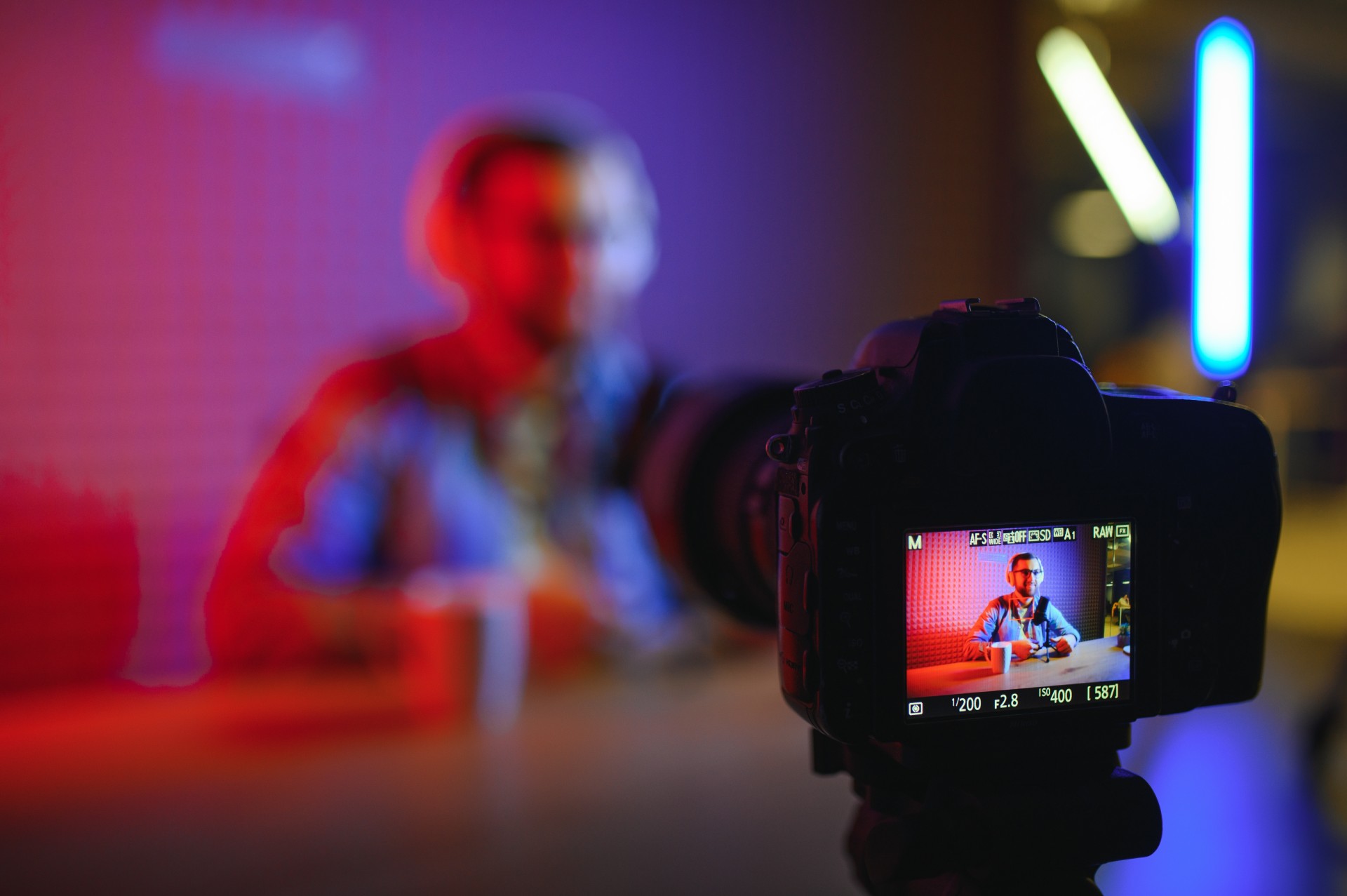
Lower thirds are the text graphics that appear in the lower portion of the video frame to identify speakers, provide contextual information, display titles, or highlight key data points. They are called lower thirds because they traditionally occupy the lower third of the screen, though modern usage has expanded the term to include any text graphic that sits in this general region of the frame.
In professional television, documentary filmmaking, and corporate video production, lower thirds are as standard as any other production element. They appear in news broadcasts to identify reporters and interview subjects. They appear in documentaries to provide dates, locations, and expert credentials. They appear in corporate presentations to identify speakers and display titles. And they appear in podcast video content to introduce hosts and guests, mark the beginnings of new sections, and highlight key insights.
Despite being standard in professional video production, lower thirds are one of the elements that most frequently reveal the difference between amateur and professional video content. A lower third that is poorly designed, awkwardly timed, incorrectly positioned, or animated with excessive flair draws attention to itself rather than serving the viewer's informational needs. A lower third that is well designed, correctly timed, appropriately positioned, and animated with restrained elegance adds a layer of professional polish that the viewer registers without consciously noticing.
This complete guide covers everything content creators need to know about lower thirds: their purpose and function, the principles of effective lower third design, how to create them in major editing applications, timing and placement best practices, and the specific considerations that apply to podcast video content.
The Purpose and Function of Lower Thirds in Video Content
Lower thirds serve specific communicative functions in video content, and understanding these functions clearly is the starting point for making good decisions about when and how to use them.
Speaker Identification: The Primary Function
The most fundamental function of a lower third in interview and conversational video content is speaker identification. When a viewer encounters a new speaker in a video, particularly in a long-form podcast episode where multiple guests may appear, they need to know who they are looking at and why that person's perspective is relevant to the topic being discussed.
A lower third that displays the speaker's name and their relevant credential, role, or title provides this identification immediately and efficiently. The viewer does not need to wait for the host to introduce the guest verbally, does not need to already know who the person is, and does not need to pause the video to search for the information elsewhere.
This identification function is particularly important for first-time viewers who discover an episode without prior familiarity with the show or its regular guests. For these viewers, a clearly presented lower third is the information that allows them to decide whether the person speaking has the authority and relevance to justify their continued viewing.
Contextual Information and Fact Display
Beyond speaker identification, lower thirds are used to display contextual information that supports the spoken content. Dates that place footage in temporal context, locations that provide geographic information, statistics that reinforce a claim being made verbally, and source attributions that credit the origin of quoted information are all appropriate candidates for lower third display.
In podcast video content, this contextual function is less commonly used than speaker identification, but it appears in episodes where guests share specific data, research findings, or factual claims that the viewer benefits from seeing reinforced visually as they are spoken verbally.
Branding and Show Identity
Lower thirds also serve a branding function by incorporating the show's visual identity into every frame where they appear. A lower third template that uses the show's brand colors, typography, and design language ensures that the speaker identification graphic also communicates the show's visual identity to every viewer, including those who may be watching a clip of the episode on social media without the context of the full episode or the channel page.
This branding dimension of lower thirds makes consistent template design across all episodes of a show an important production standard rather than an optional refinement. Inconsistent lower third design across episodes creates visual inconsistency that undermines the coherent brand identity that professional shows maintain.
Designing Effective Lower Thirds: The Principles
The design of a lower third graphic is governed by several principles that determine whether it serves its communicative purpose effectively or draws attention to its own visual presence.
Legibility Above All Other Considerations
The primary design criterion for any lower third is legibility. The text must be readable by a viewer in the brief window before the graphic animates out, on a wide range of screen sizes from desktop monitors to mobile phones, and against the full range of visual backgrounds that will appear behind it throughout the episode.
Legibility is determined by font choice, font size, contrast with the background, and the presence or absence of a background treatment that separates the text from the video behind it.
Font choice for lower thirds should prioritize clarity and readability over aesthetic distinction. Sans-serif fonts with clear letterform differentiation, adequate weight for visibility at small sizes, and consistent character spacing are the most reliable choices for lower third legibility. Serif fonts can work in some visual contexts but are generally less legible at the small sizes where lower thirds appear, particularly on mobile screens. Decorative or script fonts should never be used for lower thirds because they consistently compromise readability in the brief viewing window that lower thirds occupy.
Font size must balance legibility at small screen sizes against the visual weight that large text creates in the frame. Testing the lower third at the actual output resolution and then viewing it on a mobile device at a realistic viewing distance is the most reliable way to verify that the font size is adequate for mobile viewing without being unnecessarily large on desktop displays.
Contrast and Background Treatment
The contrast between the lower third text and the video image behind it is the most critical factor in legibility. White text on a light background is unreadable. Dark text on a dark background is equally unreadable. The lower third design must ensure adequate contrast regardless of what visual content happens to be present in the lower portion of the video frame at the moment the graphic appears.
The most reliable way to ensure adequate contrast is to include a background element in the lower third design that provides a consistent contrasting surface behind the text. This background element might be a solid colored bar, a semi-transparent dark or light overlay, a shaped graphic element, or a combination of these. The background element ensures that the text always appears against a consistent, controlled surface rather than against the variable and uncontrolled background of the video footage.
Some lower third designs use only a drop shadow behind the text rather than a full background element, relying on the shadow to provide sufficient contrast without a solid background. This approach is less reliable than a full background element because the effectiveness of a drop shadow depends on the brightness and detail of the video background, which varies throughout the episode.
Visual Consistency With the Show's Brand Identity
The visual design of lower thirds should be consistent with the show's overall brand identity: the color palette, typography, and design language that appear across the show's other visual assets including the thumbnail design, the channel art, and any other graphic elements used in the production.
This consistency ensures that the lower third feels like an integrated part of the show's visual language rather than a generic graphic inserted from a default template. A lower third that uses the show's primary brand color as the background element, the show's selected typeface for the speaker name, and a design proportional to the show's overall aesthetic identity creates a professional, coherent visual system rather than a collection of unrelated graphic elements.
For podcast creators in Mumbai who want their lower thirds and all other graphic elements professionally designed and implemented as part of a complete post-production service, Fox Talkx Studio provides comprehensive podcast video editing with professional graphic design built into every episode. Explore professional podcast editing and graphics services at https://www.foxtalkxstudio.com/services/podcast-editing-in-mumbai.
Proportional Scale and Positioning
The scale and positioning of a lower third within the frame should be proportional to the size of the frame and should occupy its traditional position in the lower portion of the screen without occupying so much vertical space that it obscures significant visual content.
A lower third that occupies more than approximately one fifth of the total frame height creates a dominant graphic presence that competes with the video content for the viewer's attention. A lower third that is too small to be clearly read at normal viewing distances fails its primary function of legibility.
The horizontal extent of the lower third should be governed by the amount of text it contains rather than spanning the full width of the frame unnecessarily. A speaker identification lower third that contains a moderately long name and a concise title does not need to extend to the full frame width. Appropriately sized lower thirds that occupy only the horizontal space their content requires look more refined and more intentional than full-width bars that extend beyond the text they contain.
Animating Lower Thirds: The Principles of Invisible Animation
Lower third animation is where the difference between amateur and professional video production is most immediately visible. An animation that is too slow, too elaborate, or too attention-seeking announces itself to the viewer. An animation that is appropriately brief, restrained, and smoothly executed is simply experienced as the graphic appearing, being read, and disappearing.
The Principle of Animation Brevity
The animation that brings a lower third into the frame should be as brief as its legibility allows. The viewer needs to see the full text of the lower third, but they do not need to watch a complex animation sequence arrive at that state. An animation that takes approximately half a second to bring the graphic to its fully visible state is long enough to avoid an abrupt, startling appearance while being short enough to not become a visible event in itself.
An animation lasting more than one second for a standard lower third is too slow unless the design specifically requires a more gradual reveal for aesthetic reasons consistent with the show's visual identity. Animations lasting three or more seconds are never appropriate for standard speaker identification lower thirds regardless of the visual design.
Animation Direction and Spatial Logic
The direction from which a lower third animates into the frame should be consistent with the spatial logic of the design. A lower third that slides in from the left is entering the frame from the direction that aligns with left-to-right reading languages, which creates a felt sense of naturalness in the animation. A lower third that slides up from below the frame is entering from the direction that aligns with its position in the lower portion of the frame, which also creates a natural spatial logic.
Animations that enter from illogical directions, such as a lower third that falls from above the frame into its position in the lower portion, create a moment of spatial disorientation that draws attention to the animation rather than to the text.
Ease-In and Ease-Out: The Difference Between Mechanical and Natural Animation
The timing curve of an animation, the rate at which it accelerates and decelerates through its motion, determines whether the animation feels mechanical or natural. A linear animation that maintains the same speed from beginning to end feels mechanical because natural physical motion always involves acceleration at the start and deceleration at the finish.
An animation with ease-in at the beginning, where the motion starts slowly and accelerates, and ease-out at the end, where it decelerates to a smooth stop, mimics the natural physics of objects moving in the real world and produces an animation that feels organic rather than digital. Applying ease-in and ease-out timing curves to lower third animations is a simple quality improvement that is available in every animation tool and that produces immediately visible improvement in the professional quality of the animation.
Creating Lower Thirds in Professional Editing Applications
The specific process for creating lower thirds differs across editing applications, but every professional tool provides the capability to create, save, and apply reusable lower third templates.
Creating Lower Thirds in Adobe Premiere Pro
Adobe Premiere Pro's Essential Graphics panel provides the primary interface for creating and managing lower third graphics. The Essential Graphics panel, accessible from the Window menu, provides a text tool, shape tools, and the animation controls needed to create fully animated lower third graphics within the editing application without requiring a separate motion graphics application.
To create a basic lower third in Premiere Pro, select the Type tool from the toolbar and click in the Program Monitor to create a text layer. Type the speaker name, adjust the font, size, and color in the Essential Graphics panel, and position the text in the lower third area of the frame. Add a shape layer behind the text for the background element by selecting the Rectangle tool and drawing a shape, then styling it with the appropriate fill color and opacity in the Essential Graphics panel.
Animate the lower third by enabling keyframing for the opacity and position properties of the graphic layers, setting keyframes for the in and out animation at the beginning and end of the graphic's display duration, and adjusting the animation curves for smooth ease-in and ease-out behavior.
Save the finished lower third design as a Motion Graphics Template by selecting Export as Motion Graphics Template from the Essential Graphics panel menu, which allows the template to be applied to future episodes with a single drag from the template library, requiring only the text content to be updated for each new speaker.
Creating Lower Thirds in DaVinci Resolve
DaVinci Resolve's Fusion compositing environment provides the most powerful lower third creation capabilities in the application, with full access to the node-based compositing workflow that supports complex animated graphic designs.
For simpler lower thirds that do not require the full power of Fusion, the Edit page's Text and Titles section provides preset lower third templates that can be dragged to the timeline and customized with the appropriate text content, font, color, and position settings through the Inspector panel.
DaVinci Resolve's Titles section in the Media Pool provides a library of pre-built animated title and lower third templates that can be used as starting points for custom designs. Selecting a template that is visually appropriate for the show's aesthetic and customizing its parameters through the Inspector panel is often faster than building a lower third from scratch in Fusion.
Creating Lower Thirds in Final Cut Pro
Final Cut Pro provides lower third creation through its built-in Titles browser, accessible from the toolbar. The Titles browser contains a library of pre-animated title templates, including lower thirds, that can be applied to the timeline by dragging and dropping them onto a clip or in the timeline above a clip.
Customizing a lower third template in Final Cut Pro is done through the Title Inspector that appears when a title clip is selected in the timeline. The text content, font, color, and other design parameters are editable through the Inspector controls, and the animation properties can be adjusted through the Video Inspector if the template supports custom animation timing.
For podcast content creators who want to create a consistent lower third template that can be efficiently applied across all episodes, Final Cut Pro's Compound Clip feature allows a customized lower third to be saved as a reusable compound clip in the Event Library, providing a simple workflow for applying the same design across multiple episodes.
Timing and Placement of Lower Thirds in Podcast Video
The when and where of lower third display are as important as the design itself in determining whether the graphic serves its communicative purpose effectively.
When to Display Speaker Identification Lower Thirds
The standard practice for speaker identification lower thirds in podcast video is to display the graphic within the first few seconds of the speaker's initial appearance in the episode, hold it for four to six seconds, and then animate it out. This display window gives the viewer adequate time to read the full text at a comfortable pace without the graphic becoming a persistent fixture in the frame.
For a host who appears throughout the episode, the lower third typically appears once in the opening section of the episode. For a guest, the lower third appears when the guest is first introduced. In long episodes where a significant break in the content might bring new viewers in mid-episode, the lower third may appear again after the break to re-identify the speakers for those new viewers.
The exact frame where the lower third animation begins should be set during a brief natural pause in the dialogue, avoiding placement that causes the animation to begin during a word that the viewer needs to hear clearly. An animation starting at the exact moment a speaker begins a key statement divides the viewer's attention between reading the graphic and hearing the statement, which serves neither purpose well.
Positioning to Avoid Face Coverage
The lower third should always be positioned so that it does not cover any speaker's face, regardless of how the speakers are positioned within the frame. For standard podcast video framing where speakers are positioned in the center or offset thirds of the frame, the lower third positioned in the lower area of the frame typically avoids face coverage without specific adjustment.
However, for close-up shots where the speaker's face occupies a larger portion of the frame, the lower third position may need to be adjusted lower or to a different position within the lower third area to avoid overlapping with the chin or neck of the speaker. Always review each lower third placement on the specific frame where it appears, not just on a representative frame, because the speaker's position within the frame changes during the clip as they move, gesture, and shift position.
For podcast creators in Mumbai who want their lower third positioning reviewed across every frame of every episode as part of a thorough quality control process, Fox Talkx Studio's editing team handles every graphic element in every episode with precisely this level of attention. Discover what professional podcast editing looks like with consistent graphic quality at https://www.foxtalkxstudio.com/services/podcast-editing-in-mumbai.
Lower Thirds for Social Media and Short-Form Content
The specific considerations for lower thirds in social media clips and short-form content differ from those for full-length podcast episodes in ways that content creators benefit from understanding.
Vertical Format Lower Third Design
Lower thirds designed for horizontal sixteen-by-nine podcast video need to be redesigned for vertical nine-by-sixteen social media clips. The proportions of the frame are different, the typical framing of speakers is tighter, and the position of the lower third relative to the frame must be reconsidered for the vertical canvas.
In vertical format video, lower thirds are typically positioned at the center-bottom of the frame rather than spanning the full width from left to right. The more narrow vertical canvas makes a full-width lower third proportionally much larger relative to the frame than it would be in the horizontal format, creating a dominant graphic presence that overshadows the speaker.
Designing separate lower third templates for horizontal and vertical formats ensures that the graphic proportion and positioning are optimized for each canvas rather than applying a horizontal template that looks oversized and disproportionate in the vertical frame.
Persistent Lower Thirds for Short Clips
For very short social media clips of thirty seconds or less, a persistent lower third that remains visible throughout the clip rather than animating in and out may be more effective than a timed display lower third. A clip that is thirty seconds long does not have enough duration to benefit from a lower third that displays for five seconds and then disappears, particularly if new viewers are discovering the clip on a social platform without prior knowledge of the speakers.
A persistent lower third that remains visible throughout the full clip ensures that every viewer sees the speaker identification regardless of when they begin watching the clip, which is particularly important for social media content that may be paused, resumed, and scrubbed by viewers in ways that a conventional display window might miss.
Key Takeaways
Lower thirds are a foundational visual element of professional video content that serve specific communicative functions: speaker identification, contextual information display, and show branding. Their effectiveness depends on legibility, appropriate scale and positioning, visual consistency with the show's brand identity, and animation that is brief and restrained enough to be experienced rather than watched.
Creating effective lower thirds requires deliberate design choices about font, contrast, background treatment, and proportional scale, along with animation timing that uses ease-in and ease-out curves to produce natural, organic-feeling motion rather than mechanical linearity.
Timing lower thirds to appear during natural pauses in dialogue, positioning them to avoid speaker face coverage across every frame of their display window, and maintaining consistent design across all episodes of a show are the production standards that professional lower third implementation requires.
For social media clips, separate template designs optimized for vertical format proportions and potentially persistent display throughout short-form clips ensure that lower thirds serve their communicative purpose in the specific viewing context of each platform.
For podcast creators and video content producers in Mumbai who want professionally designed and implemented lower thirds as part of a complete post-production service, Fox Talkx Studio provides the graphic design expertise and production quality standards that make every episode of your show look as professional as it sounds. Visit https://www.foxtalkxstudio.com/services/podcast-editing-in-mumbai to explore what professional podcast video editing looks like for your show.