How to Use Motion Graphics to Make Your Podcast Video More Dynamic
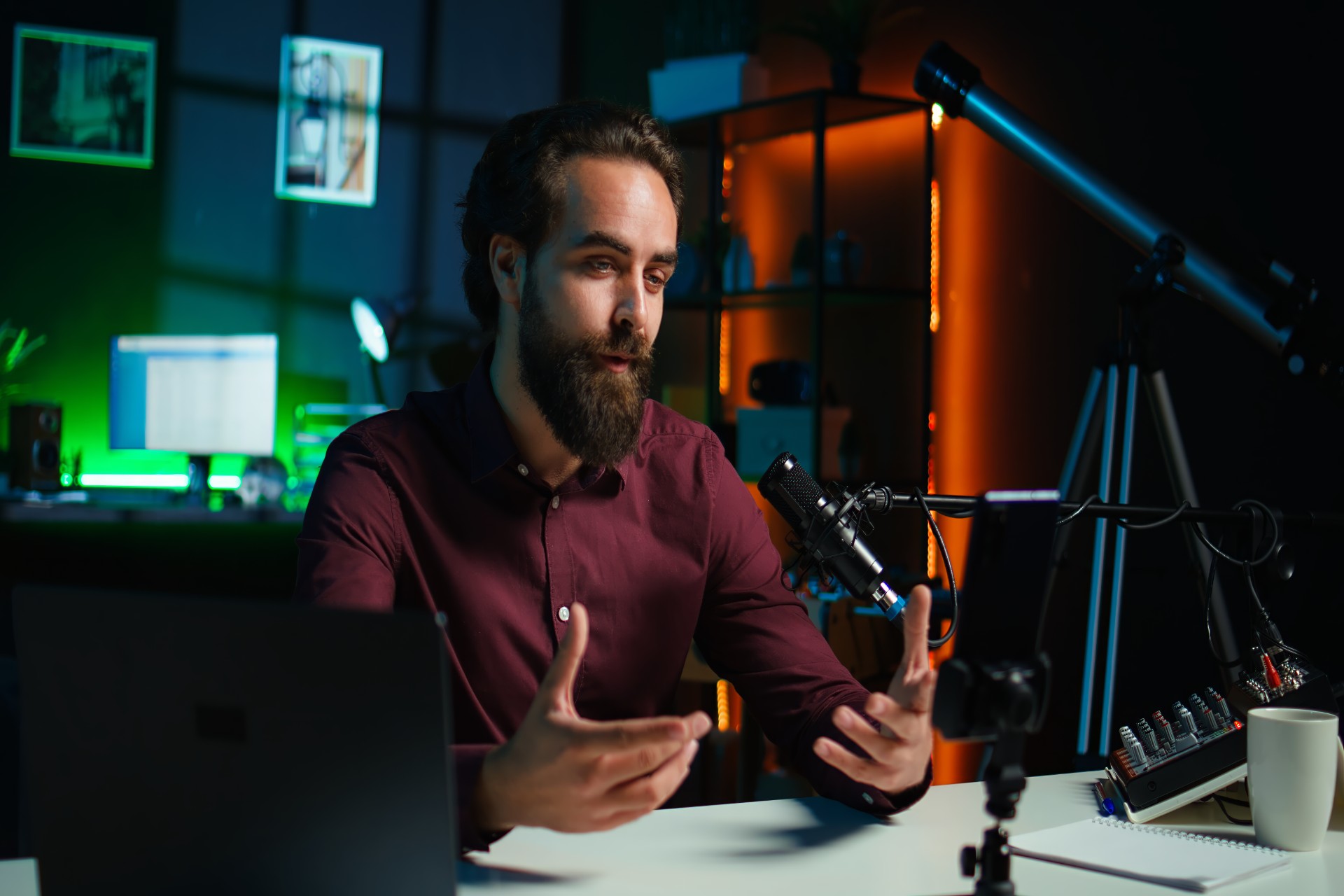
A podcast video without motion graphics is a conversation recorded on camera. A podcast video with well-executed motion graphics is a produced piece of content that communicates the show's professional identity, guides the viewer's attention toward the most important moments, and creates the visual dynamism that distinguishes content worth watching from content that is merely audible.
The distinction matters commercially. YouTube and social media audiences have been conditioned by years of exposure to professionally produced video content to recognize the difference between produced and unproduced at a glance, and to associate that distinction with quality signals that influence their viewing decisions. A podcast video that looks produced, in the specific sense that its visual language includes the motion graphic elements that professionally produced content consistently contains, communicates quality before any content has been assessed. A podcast video that looks unproduced communicates the opposite, regardless of the quality of the conversation it contains.
But motion graphics add genuine value to podcast video only when they are used with the specific editorial logic that serves the viewer's experience rather than the specific aesthetic impulse to make the video look more complex. Motion graphics that appear when they serve the viewer by communicating information more efficiently than the audio alone, by drawing attention to the most important moments in the conversation, or by establishing the show's visual identity in a way that creates recognition and trust, add real value. Motion graphics that appear for their own sake, because they look professional or because the template includes them, add visual noise that reduces the clarity of the communication rather than enhancing it.
This guide covers the complete framework for using motion graphics to make podcast video genuinely more dynamic: the specific types of motion graphics that serve different editorial purposes in podcast video, the timing and trigger logic that determines when each type of graphic should appear, the design principles that make graphics serve the show's visual identity rather than compete with it, and the production workflow that creates consistent, professional-quality motion graphics efficiently.
The Types of Motion Graphics That Serve Podcast Video
Lower Thirds
Lower thirds are the foundational motion graphic element of any interview or conversation video format, serving the specific editorial purpose of identifying the speaker on screen by name and professional context.
The specific value of lower thirds in podcast video is the context they provide to viewers who encounter the video without any prior knowledge of who the participants are. A viewer who discovers a podcast episode through a YouTube search or a social media share does not know who is speaking without some identification. A lower third that provides the speaker's name and relevant professional context within the first thirty seconds of their appearance answers this question efficiently and allows the viewer to assess the relevance of the speaker's perspective to their own interests before investing further viewing time.
The editorial logic for lower third timing follows a simple rule: each participant's lower third should appear at or within the first thirty seconds of their appearance in the episode and hold for long enough that the viewer who is paying normal attention can read the name and title comfortably before the graphic exits. For most shows, a hold duration of five to seven seconds and an animation that occupies the full hold duration with a smooth entry and exit provides the right balance between informational clarity and visual duration.
Lower thirds should be positioned in the lower third of the frame, as their name implies, in a region that does not overlap with the speaker's face regardless of their head position within the frame. The positioning should be confirmed by reviewing the animation against the actual footage rather than by placing the graphic at a theoretical position that assumes the speaker remains in a specific part of the frame throughout.
Episode Title Cards
Episode title cards communicate the episode's specific topic to the viewer in a visual format that reinforces the verbal introduction the host provides and that provides a visual reference point that viewers can connect to when finding the episode in the feed.
The episode title card is most commonly placed in the opening sequence of the episode, appearing over the intro music section before the substantive conversation begins. In this position, it communicates the episode's specific content to the viewer before any conversation-specific context has been established, which helps new viewers orient themselves to the episode's relevance to their interests before the host's introduction achieves the same orientation verbally.
The design of the episode title card should use the show's brand typography, color palette, and visual identity rather than a generic template design, creating visual consistency with every other episode in the archive that builds the cumulative brand recognition that regular viewers develop.
Chapter Title Cards
Chapter title cards mark the transitions between major sections of the episode, providing visual navigation markers that help viewers orient themselves within the episode's structure and that allow viewers who are using the video for reference purposes to locate specific sections without watching the full episode.
The editorial logic for chapter title cards requires a clear episode structure with distinct sections that have meaningful, descriptive names rather than generic section markers. An episode with three clearly defined sections covering different aspects of the central topic, where each section has a name that accurately describes its content, benefits significantly from chapter title cards. An episode with a single continuous conversation that does not have distinct structural sections does not benefit from chapter title cards and should not use them simply because the design template includes them.
Animated Quote Callouts
Animated quote callouts highlight the most specific, memorable, or impactful statements in the episode by displaying them as on-screen text while the speaker delivers them, creating a visual emphasis that draws the viewer's attention to the most important moments in the conversation.
The specific editorial value of quote callouts is the redundant communication they provide: the viewer who is actively listening hears the key statement as audio while also seeing it as text, creating a stronger memory impression than either channel alone would produce. The viewer who is partially distracted or watching in a context where their full attention is not available to the audio sees the key statement as text and receives the communication even when the audio alone might not have penetrated their divided attention.
The editorial discipline required for effective quote callout use is strict selectivity. Quote callouts lose their emphasis function when applied to too many statements in an episode, because emphasis that appears everywhere appears nowhere. The most effective use of quote callouts reserves them for the two to four most genuinely important or most memorable statements in the full episode, creating specific visual emphasis at specific moments rather than a continuous stream of on-screen text throughout.
For podcast creators in Mumbai who want professional motion graphics integrated into their video episodes as part of a comprehensive editing service, Fox Talkx Studio provides expert podcast video editing with professional motion graphic integration that serves the show's editorial and brand purposes. Explore professional podcast editing at https://www.foxtalkxstudio.com/services/podcast-editing-in-mumbai.
Data Visualizations and Infographics
For podcast episodes that involve specific data, statistics, frameworks, or structured information that is more efficiently communicated visually than verbally, animated data visualizations and infographics provide a communication channel that the audio alone cannot match.
When a guest mentions a specific statistic that is central to their argument, an animated text display of that statistic as they deliver it creates a visual reinforcement that makes the number more memorable than the audio delivery alone. When a host explains a framework with multiple components, an animated diagram that builds the framework's elements as they are explained creates a visual comprehension aid that significantly improves the viewer's understanding of the framework's structure.
The editorial threshold for data visualization in podcast video is genuine communicative need: the graphic should be used when the visual representation communicates the information more efficiently or more memorably than the verbal delivery alone, not simply because the data can be visualized or because the visualization looks impressive.
Design Principles for Podcast Motion Graphics
Visual Hierarchy and the Graphic's Relationship to the Subject
The fundamental design principle for all podcast video motion graphics is that the graphic should serve the subject on screen rather than compete with it. Every graphic element in the frame occupies visual space and demands some portion of the viewer's attention. A graphic that demands more visual attention than is proportionate to its communicative value is redirecting viewer attention away from the subject, which is the opposite of its intended function.
The visual hierarchy of a podcast video frame should always place the speaker's face and expression at the top of the attention hierarchy, with all graphic elements positioned and sized to occupy the visual weight appropriate to their communicative function relative to the speaker.
Lower thirds should be visually subordinate to the speaker. Quote callouts should be visible and legible without dominating the speaker's presence. Chapter title cards can take more visual prominence because they appear at section transitions where the speaker's face is less immediately central to the communication.
Brand Consistency Across All Graphic Elements
Every motion graphic element in a podcast video should be visually consistent with the show's established brand identity and with every other graphic element in the same episode and across all episodes of the show. Brand consistency in motion graphics means using the same typography, the same color palette, the same animation style, and the same compositional principles across every graphic element rather than using different visual approaches for different graphic types or different episodes.
This brand consistency creates the cohesive visual identity that regular viewers recognize and that communicates professional production standards to new viewers. A show whose lower thirds, chapter cards, and quote callouts all use the same typography and color system looks like a professionally produced show with a deliberate visual identity. A show whose different graphic elements use different visual approaches looks like a show that is assembling graphics from different sources without a coherent brand system.
Animation Style and Duration
The animation style of motion graphics communicates the show's character and production sophistication at a subconscious level. Simple, clean animations with smooth easing create a professional, understated impression. Complex, elaborate animations with multiple moving parts create an impression that may be either dynamic or chaotic depending on how well they are executed. Generic template animations that appear in countless other shows create no distinctive impression at all.
The animation duration, meaning how long each graphic takes to enter and exit the frame, should be calibrated to the pace and character of the specific show. Fast animations complement high-energy, fast-paced shows. Slower, more deliberate animations complement measured, thoughtful shows. The animation duration should feel natural relative to the show's tempo rather than either uncomfortably fast or tediously slow.
The entry and exit animations for each graphic type should be consistent across all instances of that graphic type in the episode and across all episodes of the show. A lower third that uses a different entry animation in different episodes creates an inconsistency that undermines the brand consistency function of the graphic system.
Timing Logic: When Each Graphic Should Appear
The Editorial Trigger System
The most effective approach to motion graphic timing in podcast video editing is an editorial trigger system: a defined set of conditions that trigger specific graphics at specific moments in the episode rather than a subjective judgment about when graphics feel appropriate.
An editorial trigger system for a typical podcast video show might specify that lower thirds appear at the first clear speaking moment of each participant's appearance in the episode, chapter title cards appear at the first moment of each major section transition, quote callouts appear over the specific statements identified in the pre-editing review as the episode's most important or most memorable, and the call to action overlay appears at the specific timing defined in the show's episode structure template.
This trigger system converts the timing decisions for each graphic from a per-episode subjective judgment into a pre-defined rule that is consistently applied. The consistency of the application creates the predictable visual experience that regular viewers develop expectations around, and the efficiency of the application eliminates the deliberation time that per-episode timing decisions require.
Avoiding Graphic Overload
The most common motion graphic mistake in podcast video production is using too many graphics too frequently, creating a visual environment where the constant appearance and disappearance of graphic elements competes with the speaker for the viewer's attention rather than serving the speaker's communication.
A useful test for graphic frequency is to watch the finished episode at normal speed specifically counting the graphic appearances and assessing whether each appearance serves a specific editorial purpose or simply adds visual complexity. An episode where graphics appear every thirty to forty-five seconds throughout its full duration has too many graphics. An episode where graphics appear at the specific moments they serve editorial purposes, typically five to ten times across a forty-five minute episode, has the appropriate density.
The Production Workflow for Consistent Motion Graphics
Template-Based Production
The most efficient approach to motion graphic production for podcast video is a template-based system where each graphic type is created once as a professional-quality template and then applied by populating the template with episode-specific content rather than creating each graphic from scratch for each episode.
A lower third template is designed once with the correct typography, color palette, sizing, and animation, and then applied to each episode by entering the specific names and titles of the episode's participants. A chapter title card template is designed once and applied by entering the specific section names for each episode's structure. A quote callout template is designed once and applied by entering the specific quoted text for each episode's selected highlights.
This template approach ensures visual consistency across all episodes without requiring new design work for each episode, and it significantly reduces the per-episode production time for motion graphic integration compared to creating each graphic individually.
Adobe After Effects for Professional Templates
Adobe After Effects is the industry-standard application for creating professional motion graphic templates for podcast video production. Its Essential Graphics panel allows the creation of Motion Graphics Templates, abbreviated as MOGRTs, that can be imported into Adobe Premiere Pro and applied to podcast video edits without requiring the editor to work in After Effects directly.
A MOGRT-based workflow for podcast video graphics allows a designer or animator to create the professional-quality templates in After Effects and export them as MOGRTs that the editor applies in Premiere Pro, combining professional design quality with editing workflow efficiency. The editor populates the MOGRT's text fields with the episode-specific content and adjusts the position within the timeline to the correct trigger point, without needing any After Effects expertise.
For shows that do not have access to After Effects or the design expertise to create custom templates, motion graphic template marketplaces including Motion Array, Envato Elements, and VideoHive provide professionally designed podcast video graphic templates that can be customized to the show's brand colors and typography.
DaVinci Resolve Fusion for Integrated Motion Graphics
For podcast video productions edited in DaVinci Resolve, the integrated Fusion compositor provides motion graphic creation capabilities without requiring a separate application. Fusion templates created in the Fusion page can be applied as timeline elements in the Edit page, providing a comparable workflow to After Effects MOGRTs in Premiere Pro within a single application environment.
The Fusion workflow's integration with DaVinci Resolve's color grading tools provides an additional advantage for podcast video production: the motion graphics and the color grade are applied within the same application and the same project, eliminating the export and reimport steps that an After Effects-based workflow requires when the color grading is also done in DaVinci Resolve.
Quality Control for Motion Graphics
The Graphic Review Pass
After all motion graphics have been applied to the episode, a dedicated graphic review pass that specifically evaluates the graphic elements separately from the editorial content ensures that every graphic detail meets the show's quality standards before the episode is exported.
The graphic review pass should specifically check the timing of every graphic entry and exit for natural alignment with the conversational flow, the accuracy of every text element in every lower third and title card, the visual consistency of every graphic element with the show's brand standards, the absence of any graphic element that overlaps with a speaker's face during the hold period, and the correct application of every graphic type at every editorial trigger point.
This dedicated review pass is more efficient than attempting to assess graphic quality during the same pass that evaluates editorial quality, because the focused attention that each type of review requires is different and attempting to apply both simultaneously typically results in reduced accuracy for both.
For podcast creators and production teams in Mumbai who want professional motion graphic integration managed as part of a comprehensive video editing service, Fox Talkx Studio provides expert podcast video editing with professional motion graphic design and integration that brings every episode to broadcast quality. Visit https://www.foxtalkxstudio.com/services/podcast-editing-in-mumbai to discover what professionally produced podcast video looks like for your show.
Key Takeaways
Motion graphics make podcast video more dynamic when they are used with specific editorial logic that serves the viewer's experience rather than for aesthetic complexity. The specific types of motion graphics that serve podcast video are lower thirds that identify participants, episode title cards that communicate content, chapter title cards that provide navigation, animated quote callouts that emphasize key statements, and data visualizations that make complex information visually accessible.
Design principles require that every graphic element be visually subordinate to the speaker, brand-consistent with the show's established visual identity, and animated at a pace appropriate to the show's character and tempo.
The editorial trigger system converts timing decisions from per-episode subjective judgments into pre-defined rules that are consistently applied, creating the predictable visual experience that regular viewers develop expectations around and eliminating the deliberation time that per-episode timing decisions require.
Template-based production through After Effects MOGRTs in Premiere Pro or Fusion templates in DaVinci Resolve ensures visual consistency across all episodes without per-episode design work and significantly reduces the production time for motion graphic integration.
Quality control through a dedicated graphic review pass that evaluates every graphic element separately from the editorial content ensures that every detail meets the show's standards before export.
For podcast creators in Mumbai who want professional motion graphic integration as part of a complete video editing service that takes every episode to broadcast quality, Fox Talkx Studio provides the complete production expertise and design capability that makes every episode look as professional as it sounds. Visit https://www.foxtalkxstudio.com/services/podcast-editing-in-mumbai to explore professional podcast video editing for your show.